Rotate your tablet
for a better experience
Rotate your tablet
for a better experience
A self-taught French artist from Vichy, Renaud Sauzedde began his professional career as a graphic artist in the skateboarding industry. He went on to create his own guitar brand called Wild Customs. He then delved into tattoo art and opened his own studio, VichyVenice, in 2018. More recently, this eminently versatile artist, an optimist and a compulsive worker, has produced his first pieces on canvas. This form of expression is a genuine renaissance: derived from SoZ’s love for street art and Art Nouveau.
@So.Z
I’m a painter, but I was a graphic artist for 15 years. That still hugely influences my creative process. As part of my job, I used to create logos, and when I paint, I’m still striving for that same simplicity and powerful graphic expression. Simplicity is sometimes difficult to achieve, but that’s what I find interesting, actually. I separate colors as I used to when I was working on graphic illustration software. I have simply applied what I previously learned to different artistic mediums.
My inspiration and graphic culture come primarily from poster art (I was particularly inspired by Art Nouveau), and from the world of board sports (skateboarding in particular, which is highly creative and new styles are continually emerging). Over many years, I only did black and white illustrations. Color came later.
My work in black and white helped to hone my skills. For example, I learned to create contrast by adding texture – crosshatching or dots – to my drawings. It gave my work a cartoon quality. I was also strongly influenced, maybe unconsciously, by Japanese prints and tattoo art. Again, mastering black and white drawing, and texture, are very important for readability and graphic compositions.
I strive to maintain a childlike sense of wonder. I am a real daydreamer, so I’ve obviously always been attracted to everything that has to do with space, space travel, the unknown, the imaginary, and the discovery of new worlds. I’m not a scientific type. On the contrary, I tend to think of space from a more “philosophical” point of view. Actually, I think it’s a field where science and philosophy come together!
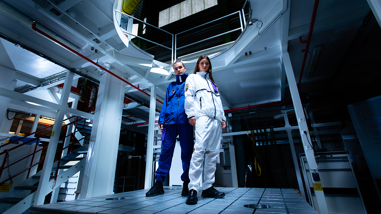
In terms of the project with ArianeGroup, I tried to remain true to who I am, to embrace my dreaming, guileless self. I’m convinced I’m not the only big kid to love rockets and to look up wistfully at the stars. There’s no age limit for that sort of thing!
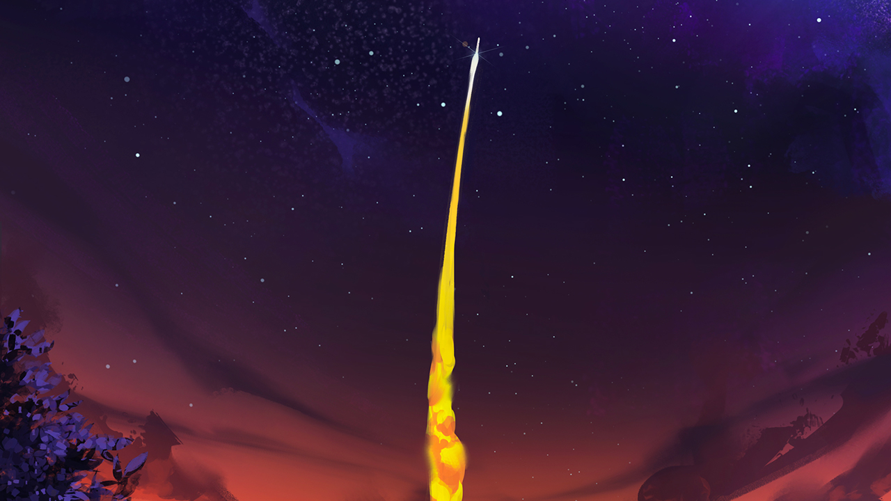
It’s simply the future! ArianeGroup has accomplished an incredible feat! The launcher is the result of years of relentless work and research. That in itself is inspiring. I’ve also always wanted to be present at a launch at Kourou. The photos are always amazing. I think that when you witness such an event, such an accomplishment, it must feel like a you’re really in a dream!
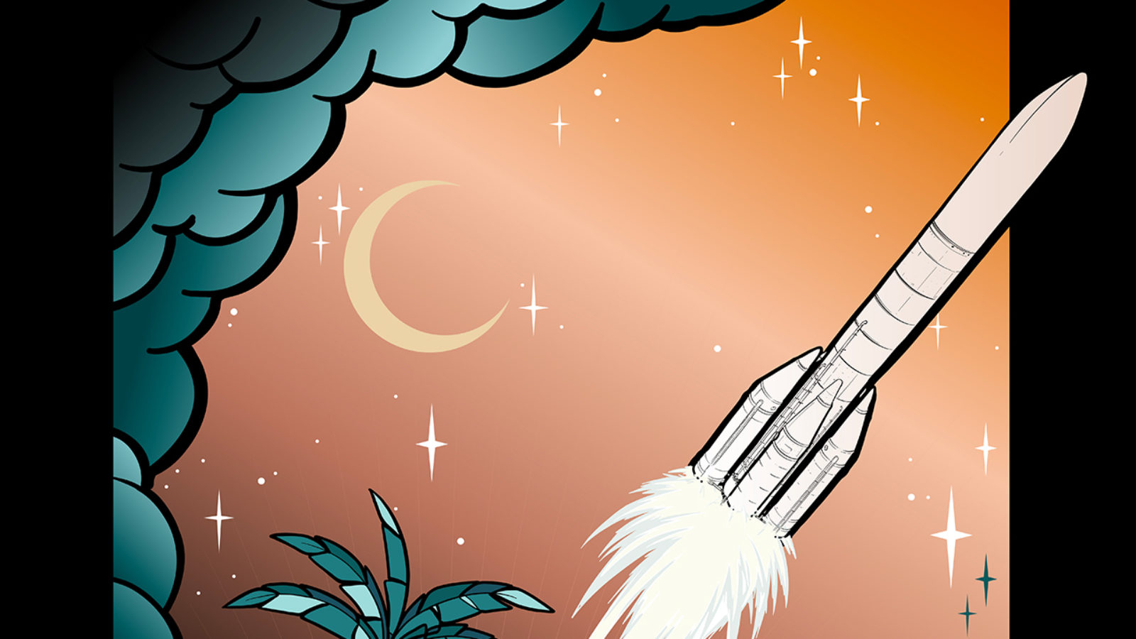
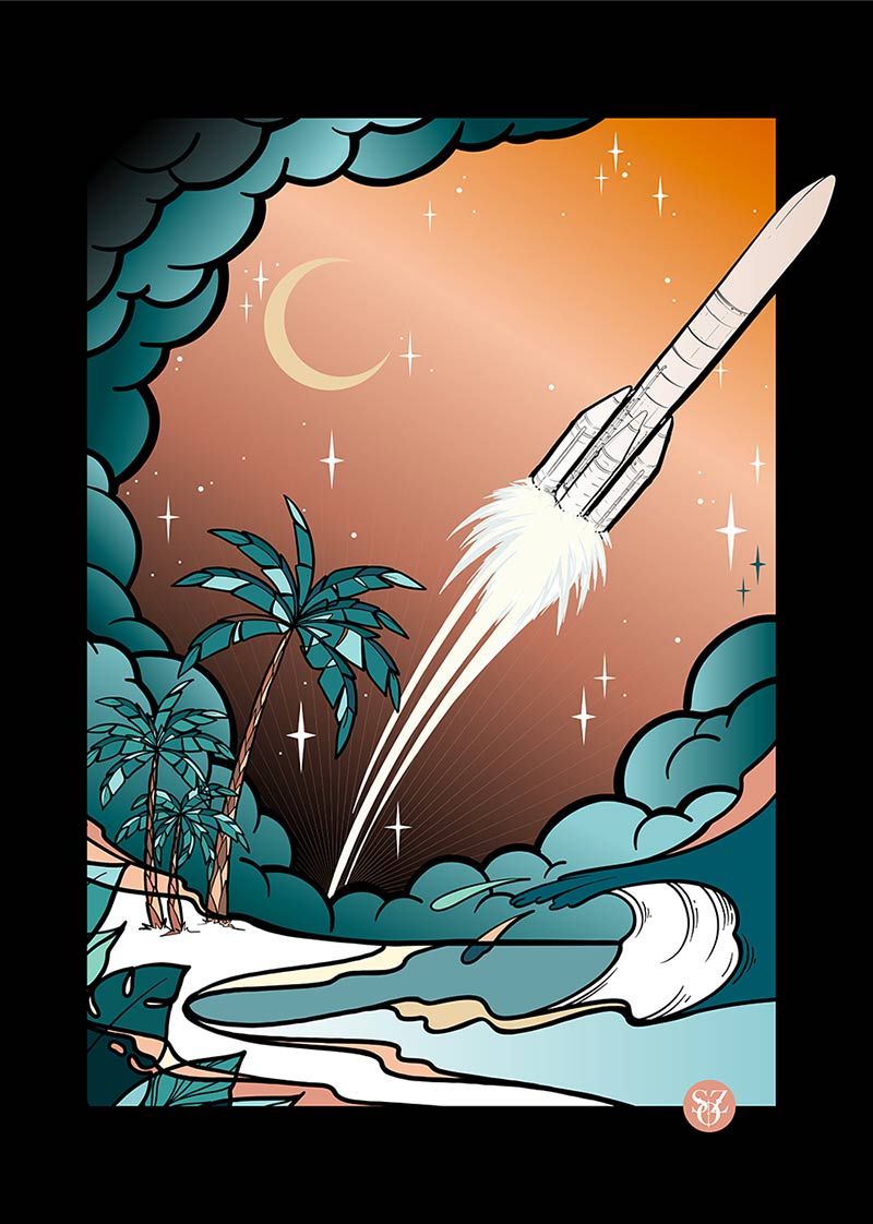
Nature is always a part of my art; increasingly so. My depiction of it is neither too figurative nor too abstract; all my illustrations include organic imagery. Combining nature with industrial elements seemed quite intuitive. I mentioned Kourou before; it’s what you would imagine in such a setting: technology and industry surrounded by jungle. It seems to me that this combination of different worlds must be fantastic to observe!
I love drawing waves, that’s true. I’ve always been drawn to the sea, and to the force of nature that it represents. I wouldn’t attempt to understand it. When I paint or draw, I let inspiration flow without giving it too much thought; I allow myself a maximum of freedom and let my heart and my intuitions do the work! Two thirds of our beautiful blue orb is covered in water: in my illustration, it’s a tribute to travel and to planet Earth. It’s also perhaps my way of advocating for the environment and for nature, but with an utterly positive and optimistic note.
It’s very hard to explain my color choices. The same goes for my graphic compositions. My work is very intuitive; I let my feelings speak for themselves. I don’t plan on using any particular colors beforehand. On the contrary, I use one, then another; I try to create harmony among the colors I choose, as intuitively as possible. Even if I don’t do it on purpose, I’ve noticed that there is often a balance between softer shades and vibrant ones.
Click this link to see the ArianeGroup illustration by SoZ :